

Table of Contents
We all get used to the fact that functionality of the application means a lot. However, the design is what really makes a solution stand out. Design with the properly selected color scheme is able to attract the attention of potential app users and make them interested.
For many years colors have been associated with brands. If you see an icon in white and red colors with a play button on it, you will immediately know that this is YouTube. Deep green and white colors are associated with Starbucks, yellow and blue – with Ikea. And there are hundreds of such examples.
Design is able to highlight your brand, make it memorable and eye-catching. It can even become a decision making point for your potential customers.
As research shows, people make a subconscious judgment about a product within 90 seconds of initial viewing and that between 62% and 90% of that assessment is based on color alone.
CCICOLOR – Institute for Color Research
That is why it is so crucial to stay aware of the key principles of color selection and combination, and pay special attention to the changing design trends. So in this article we will share with you the basics of color theory, key tips and tools that will help you to choose the right color palette for your app.
Color theory and wheel
At a first glance it seems impossible not to get lost in the endless number of possible color undertones, shades and combinations. And based on our experience we can say that the work of designers is complicated indeed.
So you may be wondering if the designers have any particular guidelines when they select colors for a mobile or web application. And the answer is – yes, they all are guided by the color theory, design trends and the colors associated with your brand.
To begin with, let’s take a closer look at the color theory, how it appeared, and what tool it has to make the color selection task easier. Basically color theory is a science that explains how to use and mix colors, which ones of them are the matching or contrasting ones. Also color theory explains how the colors communicate, what methods and approaches can be used to replicate them. It is not only about science, it is also about the art of color usage.
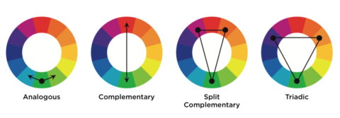
Color theory divides all colors into 3 big categories and organizes them in a color wheel that you’ve probably seen on the Internet many times. The first color circle was offered by Isaac Newton in the 17 century and it demonstrated the relations between the selected colors. Many other scientists and painters then created their own images of color wheels. Here is, for example, the one of Claude Boutet.
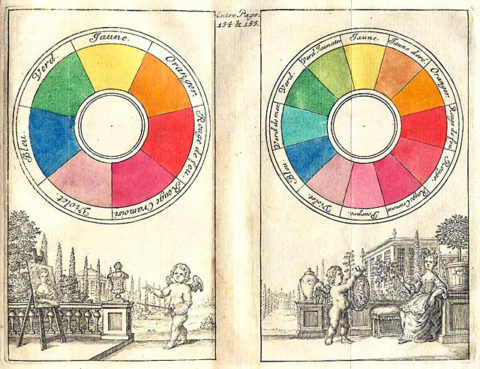
Image source: Wikipedia
As we’ve mentioned above, the color wheel implies that there are three main groups of colors. They are primary, secondary and tertiary.
But to know the colors is not enough, what really matters is the way they can be combined and organized into color palettes. After all, the main goal of the designer is to create a visually pleasing look of the app and this can be achieved if you fully understand how colors match together, what shades go well with each other, and what tones look the best.
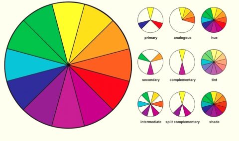
As it can be seen from the picture above, the color wheel helps designers to work with colors easier and to select proper combinations. There can be many variants of great color palettes if you understand such basics as hue, tint and shade, and how the colors go with one another.
- Shade makes the colors darker and it defines how much black color was added into the hue.
- Hue is an original color as it is without addition of any shade or tint. Any of the secondary or primary colors can be considered a hue.
- Tint shows how much white pigment is present in the color. So basically it makes all colors more light and transparent.
- Temperature defines whether the colors you select are cool (shades of blue, purple, green), warm (shades of red, orange, yellow) or neutral (black, white, brown or grey).
- Tone of the color appears when you add both black and white to it. Tone refers to any purely pigmented color that was mixed with purely neutral grey.
Color harmony is the most important part of the design which every professional strives to achieve. Color palettes should make sense together, be complementary and look exquisite. Otherwise the app will lose its attractiveness and end up looking messy, chaotic or overloading the sight. And even the powerful feature set will not be able to save it.
Color models and palettes
You’ve probably heard about color models called RGB and CMYK. These acronyms stand for Red, Green and Blue (RGB) and Cyan, Magenta, Yellow, Key/Black (CMYK). But do you know what these models are used for?
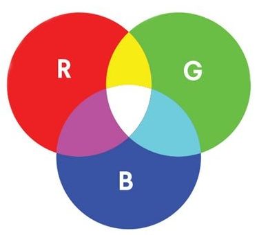
RGB is a color model used for digital images that are shown on displays. RGB is also perfect for creating colors that will be displayed in web browsers.
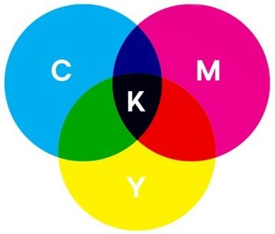
CMYK is a more suitable color model for printed images. CMYK is used for creating business cards, stickers, posters, billboard images, brochures and other promoting paper materials.
Now when you know about the main two color models, it is time to proceed to color palettes and the main rules of their creation. For the digital design the professionals use various HEX (hexadecimal) codes that transmit to the computer what color you would like to be displayed. Here is how HEX codes can look.
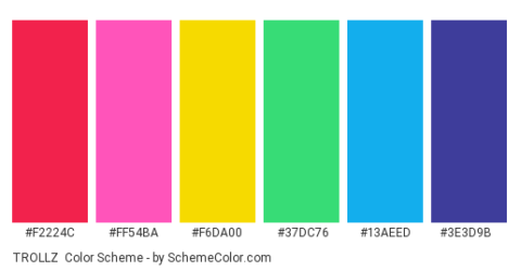
Image source: SchemeColor
So by using a color wheel designers can create numerous color palettes for various digital solutions. And while the variety of colors strives to eternity, there are several main types of color palettes that all designers take into account while creating the look of an app or website.
How to select the color palette for your app
Many people come to the developers teams without knowing for sure what look and functionality they’d like to add to their future application. And that is totally fine, since such specialists as Business Analyst and Designer can help you shape your idea.
While Business Analyst will research the market to identify what can become your strong competitive advantage, the Designer will work upon your app look. And while selecting the right color palette, the Designer will follow some key rules which we will describe below.
Explore psychology of color
It’s a well-known fact that colors influence our emotions. So when you choose colors for your app you need to think about your brand identity, concept and the effect you want to achieve. The design of your solution should convey a certain message and mood. And that is what color psychology studies for years. Trends come and go, but some basic principles remain with us for years.
Colors can drastically influence the behavior of your app users, accentuate what’s important for your business, and encourage people to buy something via an app. Every color has positive and negative connotation, and this should be taken into account.
For example, red color may mean power, security, speed. And at the same time it’s associated with danger, aggression, defiance. Or let’s take blue, it can mean trust, intelligence and calmness. But its negative connotation implies coldness and sadness.
If you are interested in this topic, you can explore the info about more colors by watching the video below. It also has some great real examples of color usage.
Take into account your audience
The responses to colors depend not only on the color itself, but also on some personality related factors. For example, people of different genders, age groups, or cultural experience will react differently on the color palette of the application. While young generation prefers brighter color schemes, the adults will rather install a solutions that has more restraint, classic look.
So before choosing a color palette for your app, make sure you know what your target audience is. If your solution is for business purposes and you need it to work with serious clients, then give your preference to more neutral colors with complementary accents. If you develop a solution for entertainment and it will be used by students and people under 35-40 years, then you can choose more vivid colors. Like we did when we developed Mazaaks.

Number of colors and their contrast
It is very important not to get too carried away when designing your app and select no more than 4 colors. Here is why you need so many:
- One color will be dominant;
- One color will be used for text;
- Two colors will be used for accentuating the elements (it is also possible to use their shades).
The dominant colors is the most important one in this list since it will be strongly associated with your company. And other colors should complement it and create a finished, well-polished look. The color of text should be pleasing for the sight so that the app users can easily read everything. The elements like buttons, pop-up notifications need to stand out and be easily noticeable.
As to the contrast, it is better to use mid-level of it and add highly contrasting elements that need to draw users attention (like different call-to-action buttons, operations errors, etc.). Also pay attention to the contrast of the background and text colors. They should not contrast each other too much because it will make the text unreadable.
Pay attention to UI rules
Whatever solution is being designed, the specialist should not forget about the UI. Thanks to the colors, graphics, and visual hierarchy the designer creates visually comprehensive navigation and structure, and he also controls users attention and can guide it where it is really needed. The designers also follow certain UI guidelines among which you can find the following:
- The designer should combine the colors correctly (since some of them go well together and some are not meant to be mixed). And the color wheel helps to do this.
- It is necessary to create color unity and coherence, and to strive to minimalism by avoiding overly colored decisions.
- The elements that are responsible for different functions should be of different colors.
- Avoid using the same color for interactive and non-interactive elements.
- Use dark colors for text to ensure legibility on the light backgrounds.
- Keeping light colors for backgrounds and use bright colors for accents.
Delegate UI/UX design to professionals from Altamira
Needless to tell that the design and selection of color scheme for your application can be tricky. You may think that you’ve done everything right and yet the users will have different opinion. The thing is that while designing an application some people tend to neglect UX or sacrifice it to make UI very trendy. But trendy does not always mean useful and satisfying. UI and UX go hand in hand and should work for one crucial purpose – make an app intuitive and visually pleasing. And that is exactly why you need a professional designer to complete your solution look.
Here at Altamira we know how important it is to take a high quality code and wrap it in a beautiful design that will be suitable for this or that business industry and its objectives. Every button, loader and window should be well though out and perfectly placed. Only when every app option is easy to find and activate, can the app be called a success.
Speaking about the design, Altamira team prefers to follow the latest trends but at the same time combine them with the best practices. This lets us achieve the expected (or even better) outcome. By now you may be wondering how exactly we can help you. So here is a short list of services we can offer:
- Discovery stage – it’s a holistic research of you business niche, key competitors, project requirements and then writing of specifications and project vision. Discovery stage may end up with creation of your future project wireframes and selection of its color palette and design concept.
- App design and development – you can come to us with a great app idea and suggestions and we will turn them into a real project. Based on your requirements, needs and expectations we will create logos, design and spice up your solution with a set of incredible features (able to make your app highly competitive and noticeable on the market).
- App redesign and modernization – do you have an app but feel that it is a little bit outdated and its visual or functional part can be improved? Then come to us and let us help you with that. Altamira team specializes in app redesign and modernization. We can do a code review, design review and market research to offer you a new design and feature set that will be a perfect fit for your business.
You do not need to struggle with the development and design. All you need is a reliable team like Altamira to achieve the desired results. Delegate all the technical routine to us and let us do our job while you are taking care of your business. As a proof of our professionalism, we’d like to share with you our page on Awwwards.com that contains the list of our best design projects (many of them are award winners). Take a minute to look through those projects to get inspired!
Best Tools for selecting color palettes
You may be interested how designers manage to select color palette for each project because this procedure seems time consuming and complicated. Well first of all, they listen to your needs and requirements, explore your brand and then offer several variants of color palette for your project. So for you as a client it is crucial to formulate the requirements correctly to get the best possible result.
And now let’s get back to our topic, and discover how designers manage to select perfect color combinations. It is not a secret that many specialists use not only the color wheel, but also some digital tools. Those applications help with creation of color palettes. We will share with you a couple of the most useful digital helpers.
#1 Coolors
This is one of the most popular and easy-to-use color palette generators. Coolors can be used directly in your web browser or even on the go if you have an iOS device. Not only you can create your own palette, you can explore the most trending and tasteful ones created by other designers and talented people.
This solutions helps to generate a whole palette in a couple of clicks. Then you can adjust the selected colors, select necessary shades, copy HEX code of the particular color, move colors, create collage or even upload a picture and create a palette based on it. Coolors is a multifuntional and extremely handy professional tool.
#2 Colormind
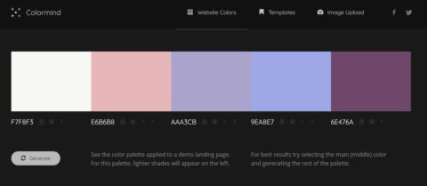
Colormind is more advanced color palette generator as it uses deep learning for provide its users with instant color combinations recommendations. This solutions can easily detect the colors on the picture, lean color style from movies, or popular media sources used by you as an inspiration materials. Quite impressive and very useful solution that even a junior designer can master in a couple of minutes.
FAQ
To summarize
So as you’ve probably understood, the design is the final and main touch added to your app. It’s like a cherry on a cake, makes your solution more attractive and noticeable. To create a good looking design it is crucial to be guided by the main color rules. The selection of colors, their tones and shades is of an utmost importance. If you overdo it, your solution will not be visually pleasing. And you definitely do not need that.
But do not worry, you do not need to dive into the science of color too deep. There are professional designers who mastered the color palettes creation long ago, and now would be happy to create your app design able to outshine all competitors. All you need is to find the team that’s easy to communicate and work with, and entrust them with you project idea.


