


Every web or app development project involves three-step design phase: wireframing, mockup design, and prototyping.
While wireframing and prototyping are broadly described and detailed on the internet, the mockup design passe? unnoticed. That’s why we’d like to dedicate a specific article for a mockup design stage because it is the most undervalued and time-consuming part of the process.
Why is the Mockup Design so Confusing?
The purpose of wireframing is to work in a really minimal way. You just start by organizing the information and figuring out the flow of a page. The wireframing is done before worrying about all the details like fonts and colors. The wireframing allows designers to work really quick and generate lots of ideas on website’s structure without getting into details.
Wireframing is one of the very first steps (along with discovery stage) in web development that can be performed even by the client himself. Although it will be more efficient to design wireframes with the help of a skilled designer at hand.
Prototyping is somehow similar to wireframing. It is not a rocket science. The persone only requires the proficiency in special software (we use InVision for prototyping) and mockup design. Prototyping is something similar to filling the blank boxes with text and pictures and then connecting them like Lego blocks.
In contrast, mockup design sits right in the middle of the wireframing and prototyping. It requires far more expertise, taste, sense of style, and all those fancy skills professional designers possess.
The purpose of mockups is to show the end user the look of the product without having to build the software itself or the underlying functionality. In the web, development mockups are static designs of the pages minus the specific content. Mockups are used as a guide for developers and as a presentation material for investors.
Unlike wireframes, mockups are complete designs. They possess the precision of details required for development.
- UI icons.
- Pixel-perfect UI placement.
- Fonts.
- Background images.
- Shapes of objects.
- Colors for each object.
- Size relations of objects to each other.
As you have already noticed, such kind of precision requires special skills designer possess. But also mockup design requires just as much attention from the customer. This is exactly the step where you put your soul into your product
How to Make a Mockup
Now, when your design team gets to website mockup design there is a number of choices you’ll be responsible for. Don’t panic. We won’t leave you alone to make those decisions. Instead, the design team will provide you with bets variants to choose from. All the options that we’ll offer are already good, your task will be to choose the best one that fits your idea.
Questions to answer upfront
The important parts of web or app page mockup design process are typography, color, whitespace, and consistency.
Typography can completely change the look and mood of your website. Fonts should adhere to the style and theme of your project. Try Google Font, it is one of the best free resources for finding new fonts, you can use to search for references and they are freely available to use in your apps and websites.
This make take some trial and error to find the right font but keep in mind the goals that you have in the feeling your website to have. Using a serif font may make your project seem editorial or academic. On the other hand, sans-serif can bring that much needed modernistic touch to the design.
If you have in mind some kind of stylistic display font make sure that it is legible and use it sparingly.
You also may consider a complementary font, which could be used to establish a visual hierarchy and separate heading from content. This is extremely helpful if you have lots of text content. Otherwise, it will be enough to use a proper font weight to establish hierarchy. Especially if you’re building a mobile app that is limited in space.
Advice: Use more than two fonts only if absolutely necessary.
Color palette obviously has a huge impact on the mood of your website. colors are arguably more important than a typeface. Especially if we’re creating the mockup for mobile application. You have to use it with purpose and sparingly.
You’ll generally have one or two primary colors, or one or two accent colors on your website. For a mobile app, it’s better to limit color palette even more: a single main theme color and one accent color will be enough.
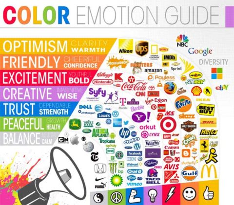

There are tons of websites to help you to come up with color palettes. E.g. Adobe Color Wheel. As long as you have two colors with a good contrast between them you should be alright.
Advice: The world is moving towards simplicity choose one primary color and stick to it.
When you apply these colors make sure it is in a consistent fashion. Your color should serve a specific purpose. Set yourself a small list of rules on how to use your colors. E.g. Primary colors for a menu and informational buttons; Accent color for Call to Action buttons.
White space, also called negative space, is what keeps your project from turning into a mess.

Once you get the first variant of website mockup take a step back and take a look at your design. How do you like it? Is there an appropriate amount of white space between the objects?

White space can help you attract user’s attention or establish relationships between the objects.
Or it can be used to guide user’s attention.
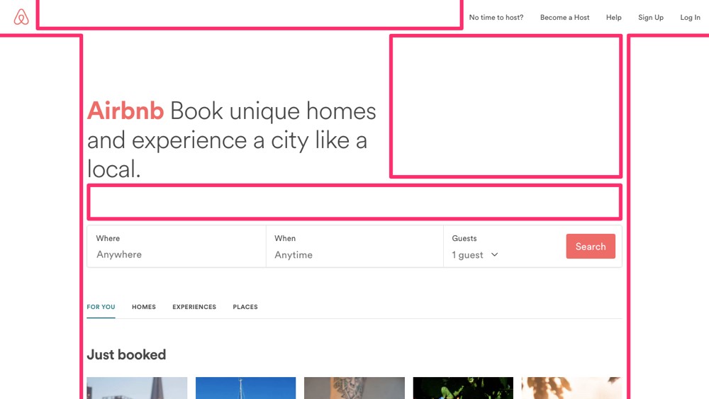

Don’t be afraid to use white space and use it consistently. It can provide simplicity to your design. Here’s how much white space on Airbnb’s website. Always keep in mind: if you caught user’s attention he won’t mind scrolling your website to the bottom.
Bottom Line
Once you made few iterations take your design to someone to test it. Give it to someone representative to the audience and get their opinion and thoughts. Ultimately the visitors are the end judge of your design.