

Sparkle – Social Network and Video Chat
Location-based social mobile app development that turns strangers into neighbors. Sparkle Chat simply transforms public space and lets users discover and chat with interesting people nearby.

About Sparkle
The smartphone can be a great time killer while waiting for a bus or a friend. You can dive into a game or scroll Facebook newsfeed. Sparkle live talk community aims to transform wasting time into spending it efficiently by preserving the fun and bringing new connections.
Here, young and active people can find new friends worldwide who share happiness and same interests or at your exact location and join them. Turning strangers into neighbours can bring a lot of benefits, after all.
Expertise
Scope
Vertical
01 The Challenge
Sparkle Chat is super easy to join and dive in. You can log in via Facebook to find a party or lunch companion nearby. Sparkle lets you create as many chats as you want and keep in touch with people you like for as long as you are interested.
The client came to us with the idea of connecting people with a chat when they need to waste their time. We grew this idea into something bigger, a social network where you can quickly turn strangers into neighbours.
02 The Solution
Use cases
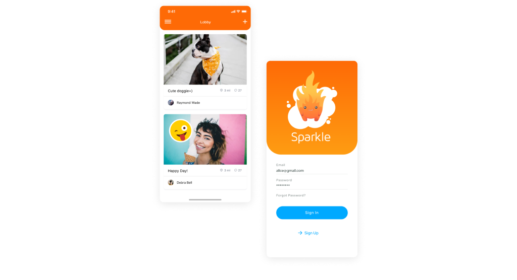
Lobby
Since the main purpose of Sparkle Chat is to socialize with strangers, we created a Lobby. This is the first screen the user encounters after login.
Lobby displays all chats within a set radius around the user. The radius is set upon chat creation and grants access (becomes visible) for those inside its range.
Each of the chat units contains the following:
- Name of the chat
- Author’s avatar and name
- Cover as a graphical representation of topics that are discussed inside the chat
- Emoji that represents the author’s mood
- Radius setting to display the approximate location of chat participants
- Number of participants and posts inside the chat.
While browsing Lobby, users can see new chats appear instantly on the screen with no need to refresh the page. This way, we ensure users won’t miss new opportunities to socialise. In addition, we’ve integrated endless scroll instead of pagination; thus, we improved page loading speed and UX as a whole.
New chat creation
In order to encourage users to be more active, we’ve created a simple posting screen where they can start a new chat in a few clicks. Moreover, we do not limit users from deleting chats they have created previously allowing to end the conversation at any time.
5 fields are filled in seconds:
- Photo: You can either snap a picture of something around or upload it from your camera roll.
- Set of smileys: This is your mood. We offer a rich set of emojis, but it’s up to you whether to fill this field or leave it blank.
- Subject field where you can set a topic for a future conversation: question, request, or an invitation to the party.
- Location is optional if you have a specific audience and discover your location. Or you can leave it blank and stay completely anonymous.
- Radius of chat’s coverage. This option sets the range within which chat will be available to users.
Navigation
A simple sidebar that allows users to navigate through Sparkle Chat with ease.
A few extra options at your fingertips:
- Notification settings to get all new posts and chats within your range.
- The option to log in under a new profile and make a fresh start.
- Facebook sharing lets you reach new people and invite them to join your chat. This option encourages users to share Sparkle Chat with friends and, therefore, boosts the penetration rate as long as we tend to download apps that our friends suggest.
Notifications
According to the latest UX surveys, people are annoyed with the numerous notifications they receive. In some cases, such obtrusiveness may become a stop factor and lead to the application removal. Hence, we dedicated a separate settings screen to manage Sparkle’s notifications.
Unseen or disabled notifications are collected on the “Notifications” page inside the app.

03 The Result
Wireframes
The development process starts with wireframe design. In this phase, we defined navigation routes and the app’s major screens to direct users to the most important features of Sparkle Chat.
Those are Posting and Lobby. Hence, we ensured that these stand-out features appeared on the first screen.
Report and Comment functions are tied to swipe events. This way, users are not encouraged to use chats for trolling and flame wars. However, these functions can be used to flag offensive or malicious content.
NOTE: According to Apple Guidelines, apps with user-generated content or social networking services must include a report or block mechanism. Otherwise, the application will be banned from submission to the Apple Store.
After creating a full set of wireframes, we moved to the designing phase of Sparkle Chat development.
We took the Scrum method of Agile software development with 1-week sprints.
Before each milestone, we had a meeting to go through the upcoming sprint in order to ensure that each team member understood how the feature should work, to discuss how much time it should take, and to discuss the expected results.
Our Quality Assurance team performed testing at the end of each development sprint. After QA, we passed the test version to the client for an Acceptance Test and then moved to the next milestone.
By moving this way, we came to the final delivery of Sparkle Chat and its submission to the Apple Store in a short time.
Technologies

Logo evolution
An idea behind the application is “gathering sparks to ignite a fire.” Therefore, we suggested a character logo so users could identify with those sparkles. This mascot also fits the app’s first name, which was suggested by the client – “Fire chats.”
We first started with black-and-white variations to focus on graphics and not distract our clients with colours.
Our client liked several options, and we moved to the coloured version. It didn’t take long to create a colour pallet.
The associations were clear (fire, flame, match, flash, glow), as well as the colours behind them: red, orange, yellow, white, and blue.
Colours
The colour scheme for UI was determined by the logo’s palette. However, we wanted to enrich the colour scheme to get closer to the metaphor of fire.
We took decision to go with gradients but to make it still and “eye-friendly’. Shadows of orange and yellow were set as the main colours for the gradient.
The background colour was set to white to make it comfortable for reading. (According to physiology research, a white background is the best for eyesight, so we stuck to it.)
As well as fire can’t burn without oxygen, we selected blue as a complementary colour to contrast with the orange theme and white background. This way, we could drive user’s attention to action buttons.
Features
- Instant messenger
- Facebook sign up
- Push notifications
- Photo sharing
- Geolocation
- Emoji library
Fantastic working with team as usual.
Really impressive work both from the development team, design team, and project managers. Super happy with the work of Altamira, especially in terms of quickly understanding our needs and transforming them into a product – we will definitely work with them again.


