

Most mobile UI inconsistencies come from teams mixing platform conventions, confusing resolution terminology, or designing against device specs that stopped being relevant two generations ago.
A button that looks right on an iPhone 17 renders too small on a mid-range Android. An icon set exported at the wrong density looks crisp on one screen and blurry on the next. A layout that worked fine at 375 points wide falls apart at 402.
This is the default outcome when teams treat iOS and Android as if they share the same sizing logic. They don't. Each platform defines its own unit system, its own density model, and its own rules for how UI elements scale across devices. Get those foundations wrong and no amount of visual polish fixes the result.
This guide covers the mobile app design size rules, density systems, and spacing conventions you need for both platforms — updated for the current device landscape, including the iPhone 17 lineup and the latest Android density buckets. Whether you're trying to pin down the right mobile screen size for app design or sort out how assets scale across density buckets, the answers are here.
What designers need to know before choosing a mobile app design size
Before picking an artboard size or export setting, there are a few terms that trip up even experienced designers. The problem is that these terms sound interchangeable when they aren't.
Pixels are the smallest controllable element (typically red, green, blue) of a picture represented on the screen using those at different intensities, various colors, and range of brightness that can be created. If all the dots are off, the color is black. Equally, a white can be formed when red, green, blue are illuminated simultaneously. Pixels are the physical lights on a screen because of which you can see what is shown on the mobile screen. It isn't easy to recognize them separately without a close look.
Resolution refers to the number of pixels on display. For example, a display with 720 x 1280 pixels is much higher than a display with 480 x 800 pixels. The resolution does not define physical size. For example, one 480 x 800 display might measure 3.0 inches diagonally, while another 480 x 800 display might measure 4.5 inches. However, the display with the larger physical size would not look as good as the physically smaller one.
DPI (dots per inch) measures how many pixels fit into one inch of screen space. Higher DPI means smaller individual pixels and sharper rendering. A 460 DPI screen packs roughly three times the detail of a 160 DPI screen.
The higher DPI means that each separate pixel must be smaller in size to adjust in the given space, making the screen clear and including a higher level of detail than the actual capacity of the screen.
Screen size is the diagonal measurement of the display area, in inches. A 6.3-inch screen and a 6.7-inch screen can have very different pixel counts.
Points (pt) are Apple's abstraction layer for iOS. They let you define layout sizes that stay visually consistent across iPhones with different pixel densities.
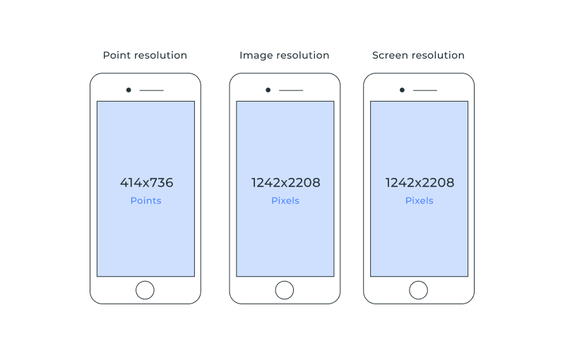
To explain what the point is, we should go back to the history of the iPhone. Once upon a time, the first iPhone had a screen resolution of 320x480. Then the iPhone 4 came along with the Retina screen. The Retina screen doubled the DPI while keeping the same screen size - meaning the number of pixels that fit into the same space had quadrupled (twice the number of pixels across and twice the number of pixels down). The resolution of the first Retina iPhone was 640x960 pixels.
The old graphics have to be created at the same size on the higher density phone. If the phone had performed all the graphics at a 1:1 scale, everything would have been drawn at a quarter the new screen size - making every app outdated. To prevent a crush of all those apps, Apple started using points and separating the drawing of the graphics from the screen's density.
The point was created as a unit of distance that allows graphics to be scaled independently of the phone resolution on which they were running. Nowadays, every iOS graphic could be drawn according to its points values and converted to display correctly on the new screen.
This size is always the same irrespective of the phone's resolution and comes from the 163DPI of the original iPhone.
Density-independent pixels (dp) are Google's equivalent for Android. Same idea: define your layout once, and the system handles the translation to actual screen pixels.
These two abstraction systems are the reason mobile design works at all across dozens of different devices. The dp vs pt distinction matters because each unit maps to physical pixels differently, and mixing them up is one of the fastest ways to break a layout during cross-platform handoff.
Pixels, Points, DP, and Density Explained Clearly
Both iOS and Android solved the same problem — screens with wildly different screen density values — but they did it independently, with slightly different baseline assumptions and scaling math. Getting mobile UI sizing right starts with understanding these two systems side by side.
What points mean in iOS design
To understand points, go back to the original iPhone. It had a 320 x 480 pixel screen at 163 DPI. When the iPhone 4 arrived with its Retina display, the pixel count doubled in each direction (640 x 960) while the screen stayed the same physical size. If every app had rendered graphics at a 1:1 pixel scale, everything would have appeared at a quarter of its intended size.
Apple's fix was the point system. A point became a unit of distance that scales independently of pixel density. At 163 DPI (the original iPhone), 1 point equals 1 pixel. At 326 DPI (iPhone 4 through 8), 1 point equals 4 pixels (2 across, 2 down). At 460 DPI (iPhone 12 and later), 1 point equals 9 pixels (3 across, 3 down).
The practical upshot: when you design a 44 x 44 point touch target, iOS renders it at 88 x 88 pixels on a @2x screen and 132 x 132 pixels on a @3x screen. The element stays the same physical size on both devices.
Today, every current iPhone uses @3x scaling. If you're designing new work, @2x matters only if you're supporting older devices like the iPhone SE (2nd generation) or iPhone 8.
Converting between points and pixels:
- @1x (163 DPI, legacy): 1 pt = 1 px
- @2x (326 DPI, iPhone SE 2nd/3rd gen): 1 pt = 4 px (2 x 2)
- @3x (460 DPI, iPhone 12 through 17): 1 pt = 9 px (3 x 3)
When the OS renders a screen, logical points are translated to rendered pixels using the device pixel ratio. This ratio specifies how many rendered pixels correspond to one point. The rendered pixel count is what you get when you multiply the screen size in points by the scale factor (1x, 2x, 3x). If you want to draw an image at maximum resolution, that's the size to target.
Physical pixels — the actual hardware resolution — can differ slightly from rendered pixels. Some iPhones downsample the rendered resolution to fit the physical screen. This matters for technical accuracy, but it shouldn't change your design decisions. Design in points. Export at @2x and @3x.
What dp means in Android design
Android uses density-independent pixels (dp) to solve the same problem. One dp equals roughly one pixel on a 160 DPI screen — the Android baseline density, compared to Apple's 163 DPI. The difference between the two baselines is negligible in practice.
Where Android diverges is in how it groups devices. Instead of a clean 1x/2x/3x ladder, Android defines six density buckets:
- mdpi (~160 DPI) — 1x baseline, 1 dp = 1 px
- hdpi (~240 DPI) — 1.5x, 1 dp = 1.5 px
- xhdpi (~320 DPI) — 2x, 1 dp = 2 px
- xxhdpi (~480 DPI) — 3x, 1 dp = 3 px
- xxxhdpi (~640 DPI) — 4x, 1 dp = 4 px
The ldpi bucket (~120 DPI) still exists in documentation but is effectively dead on modern hardware.
The formula to convert between dp and pixels: px = dp × (device DPI / 160)
For example, a device with a 1080 x 1920 pixel resolution in the xxhdpi bucket (480 DPI) has a dp size of 360 x 640. That's the artboard size you'd design against.
Android also uses scalable pixels (sp) for text. An sp behaves exactly like a dp by default, but it also responds to the user's system font size preference. Always define font sizes in sp, layout dimensions in dp.
The conversion formula from dp to pixels:
dp = pixel resolution / scale factor
For xxhdpi: 1080 / 3 = 360 dp wide. For xxxhdpi: 1440 / 4 = 360 dp wide. Different pixel counts, same logical width — that's density independence at work.
Which Dimensions to Use for iPhone Design
Common iPhone viewport ranges
The current iPhone lineup has standardized around a few core form factors. These are the iOS app dimensions that matter for design in 2026:
| Device | Screen (inches) | Points (w x h) | Pixels (w x h) | PPI | Scale |
|---|---|---|---|---|---|
| iPhone SE 4th gen | 6.1" | 393 x 852 | 1179 x 2556 | 460 | @3x |
| iPhone 16e | 6.1" | 390 x 844 | 1170 x 2532 | 460 | @3x |
| iPhone 17 | 6.3" | 402 x 874 | 1206 x 2622 | 460 | @3x |
| iPhone 17 Air | 6.5" | 420 x 910 | 1260 x 2730 | 460 | @3x |
| iPhone 17 Pro | 6.3" | 402 x 874 | 1206 x 2622 | 460 | @3x |
| iPhone 17 Pro Max | 6.9" | 440 x 956 | 1320 x 2868 | 460 | @3x |
A few practical takeaways. Every current iPhone runs at @3x and 460 PPI. The most common viewport width is 393 points (standard 6.1-inch models), with 402 points covering the 6.3-inch models (iPhone 17 and 17 Pro). If you're targeting the widest audience, design at the narrower width first. A layout that works at 390 points will almost always scale up cleanly to 440 points. The reverse rarely holds.
Height is less of a constraint than width because most mobile content scrolls vertically. Focus your layout decisions on width breakpoints.
App icon size on iOS: Apple uses a superellipse shape (not a simple rounded rectangle). You supply a single 1024 x 1024 pixel source icon, and the system generates all other sizes. Place critical visual elements within the center safe zone — the system clips corners automatically.
Explore our web development services
Safe areas and spacing rules
The Dynamic Island (introduced with iPhone 14 Pro and now present across all current models) and the Home Indicator bar both carve into the screen. iOS defines safe area insets to keep your content clear of these regions.
For iPhone 17 and 17 Pro (6.3-inch display):
- Portrait: top 62 pt, bottom 34 pt, left 0, right 0
- Landscape: top 20 pt, bottom 20 pt, left 62 pt, right 62 pt
Your interactive content — buttons, text fields, navigation elements — should sit within the safe area. Backgrounds and decorative elements can extend to the screen edges (edge-to-edge design), but anything a user needs to tap or read should respect these insets.
Apple's Human Interface Guidelines also set a minimum touch target of 44 x 44 points for any interactive element. That's a physical size of roughly 7mm — small enough to fit dense UIs, large enough for reliable finger input.
Which Dimensions to Use for Android Design
Common Android width patterns
Android's device fragmentation is real, but the practical spread of android app dimensions is narrower than it looks. Most modern Android phones cluster around a few dp widths:
| Width (dp) | Typical devices | Density bucket |
|---|---|---|
| 360 | Samsung Galaxy S series, Pixel (standard) | xxhdpi–xxxhdpi |
| 393 | Pixel 8, Pixel 9 | xxhdpi |
| 412 | Samsung Galaxy S Ultra, larger devices | xxxhdpi |
The standard design artboard for Android phones is 360 x 800 dp. That covers the majority of active devices. If you're building for tablets or foldables, you'll also need layouts at 600 dp, 768 dp, and 1024 dp width. See what's possible with cross-platform mobile app development
Android's window size classes formalize this:
- Compact width (< 600 dp): phones in portrait
- Medium width (600–839 dp): tablets in portrait, foldables unfolded
- Expanded width (840+ dp): tablets in landscape, desktop
For phones specifically, design at 360 dp wide and test at 393 and 412 to catch edge cases.
Density buckets and scaling logic
When you export bitmap assets for Android, you need to provide versions for each relevant density bucket. The scaling ratio across the six primary densities follows a 3:4:6:8:12:16 pattern.
For a 24 x 24 dp icon, the actual pixel sizes are:
| Bucket | DPI | Scale | Icon size (px) |
|---|---|---|---|
| mdpi | ~160 | 1x | 24 x 24 |
| hdpi | ~240 | 1.5x | 36 x 36 |
| xhdpi | ~320 | 2x | 48 x 48 |
| xxhdpi | ~480 | 3x | 72 x 72 |
| xxxhdpi | ~640 | 4x | 96 x 96 |
In 2026, the majority of active Android devices fall in the xhdpi to xxxhdpi range. You should still provide hdpi and mdpi assets to cover older phones, Android TV, and Wear OS devices.
The better approach for most UI elements: use vector drawables (XML-based vectors) instead of bitmaps. A single vector asset scales cleanly to any density bucket without multiple exports. Reserve bitmaps for complex imagery: photos, detailed illustrations, or icons with gradients that don't translate well to vector format.
Adaptive icons (required since Android 8.0) use two layers — foreground and background — each sized at 108 x 108 dp. The system applies a device-specific mask (circle, squircle, rounded square) to produce the final shape. Critical elements must fit within the inner 72 x 72 dp safe zone, since the outer 18 dp on each side can be clipped. Check out what's AI strategy consulting services
Font Size and Touch Targets for Mobile App Design
Touch target size and type sizing are where platform conventions overlap most — and where small mistakes create the most usability friction.
Minimum touch targets:
- iOS: 44 x 44 points
- Android (Material Design): 48 x 48 dp, with 8 dp spacing between targets
These aren't suggestions. They're the thresholds below which tap accuracy drops and user frustration rises. If your button is 32 dp tall, some users will miss it on the first try. Every time.
Font sizing:
- iOS: system font (SF Pro) defaults to 17 pt for body text. Use Dynamic Type to let users scale text to their preferred size.
- Android: Material Design recommends 14–16 sp for body text. Always define text sizes in sp (not dp) so they respond to the user's accessibility font size settings.
Both platforms now treat text scaling as a core accessibility feature, not an optional nicety. Picking the right font size for mobile app design means using each platform's scalable unit — and never hardcoding values in raw pixels.
Spacing and grid:
- Android uses an 8 dp baseline grid for layout, with 4 dp increments for smaller elements like icon padding.
- iOS doesn't prescribe a fixed grid, but 8-point spacing increments are a widely adopted convention that keeps layouts consistent.
How Altamira Approaches Mobile UI Across Platforms
Altamira has shipped cross-platform mobile products for over a decade — from consumer-facing apps to enterprise tools that run on a mix of iOS and Android devices in the field. That experience has shaped a few non-negotiable practices.
We design in platform-native units from the start: points for iOS, dp for Android. Not pixels. This avoids the most common handoff problem — assets that look right in Figma but render at the wrong size on actual hardware.
For cross-platform projects, we define a shared spacing and type scale in abstract units, then map those to each platform's conventions during implementation. That keeps the visual system consistent without forcing Android to behave like iOS or vice versa.
We test on real devices across density buckets, not just emulators. A layout that passes on a Pixel 9 emulator at 393 dp can still break on a Samsung device at 360 dp with a different system font rendering. Catching those gaps early costs less than patching them in production.
The result is mobile UI that holds up across the actual range of devices your users carry — not just the three or four devices your team happens to own. Learn more about AI readiness and AI process automation
Common Mistakes in iOS and Android UI Sizing
Designing at pixel resolution instead of points or dp. This is the single most common error. A 1080 px-wide Figma artboard is not the same as a 360 dp Android layout. You'll end up with elements three times larger than intended when the system applies density scaling.
Exporting assets at a single density. Providing only @2x assets for iOS or only xxhdpi for Android means the OS has to scale your bitmaps up or down for other devices. Upscaling produces blurry icons. Downscaling wastes memory. Export at all target densities, or use vector assets.
Ignoring safe areas. Placing interactive elements behind the Dynamic Island, the status bar, or the Android navigation bar makes them partially or fully unreachable. Design within the safe area insets for every target device class.
Using the same touch target size for both platforms. iOS minimum is 44 x 44 pt. Android minimum is 48 x 48 dp. They're close but not identical, and the spacing conventions around them differ. Don't split the difference — follow each platform's guideline.
Assuming all OLED screens render the same way. Different device generations have different peak brightness levels, different color calibration, and different subpixel arrangements. Test your color palette on multiple devices, especially if your design relies on subtle gradients or near-black backgrounds.
Skipping landscape and foldable testing. On devices with screens larger than 9 inches, landscape usage increases significantly. Foldable devices can switch between a narrow cover display and a wide inner display mid-session. If your layout only works in one orientation at one width, you've cut out a real segment of your audience.
Conclusion
Screen dimensions and resolution aren't a one-time design decision. They're a constraint you'll revisit at every stage — from initial wireframes through QA, post-launch updates, and new device releases.
The core principles stay stable even as device specs shift: design in platform-native units (points for iOS, dp for Android), export vector assets where possible and bitmaps at every density your audience uses, respect safe areas and minimum touch targets, and test on real hardware at multiple viewport sizes. Getting the app design size right on day one saves you from patching layout issues across dozens of device configurations later.
The device landscape in 2026 is more standardized than it was five years ago. iPhones have converged around 460 PPI and @3x scaling. Android's most active devices cluster in the xhdpi to xxxhdpi range at 360 to 412 dp wide. That's a narrower target than it used to be but only if you're building on the right foundations. Get in touch to learn about technology product consulting


