Table of Contents
Common screen sizes for responsive design depend on the objective, location and target audience of the website. Other factors such as regional device preferences, industry-specific requirements, and user demographics play a significant role in determining the optimal screen sizes to focus on for an exceptional user experience.
Imagine the situation when 5% of new website visitors use the latest iPad or iPhone but your website’s design is outdated and not optimized for these devices. The visitors expect your website to be responsive, and they are ready to go through a wonderful user experience. Because your design is outdated, the interface will be distorted, buttons poorly readable, and all essential elements like CTAs, links, or contact forms will expand beyond the screen sizes.
Just imagine, this 5% of new users could be having a negative first experience. Will they come back to your website? Most certainly not. It can lead to dramatic effects on the website conversion and, therefore revenue.
By incorporating the latest web design trends into a responsive design strategy, web designers can create a more engaging and user-friendly experience across different screen sizes.
Since screen resolutions and devices are constantly changing, they demand quick and qualified updates and improvements. In this article, we want to show the latest screen resolution statistics and recommend best practices for implementing them into your design.
What is Responsive Web Design?
To begin with, we would like to define what responsive design is. Responsive web design is a design approach that lets you adapt the content to website dimensions and window sizes like desktop, mobile, and tablet. This approach helps to visualize the screen look on different screens to make it responsive anyway. Responsive design also gives the ability to transform the content according to particular screen sizes for any apps like ERP PMS or Point of Sale Systems.
We suggest watching a video where you can find more basic knowledge about responsive web design and see its examples.
Why does responsive design matter?
So why is it so essential to provide a responsive design of your content? Everything is pretty clear. Today people use different devices to surf the internet – laptops, computers, tablets, smartphones, and smartwatches. You can’t let yourself create a single version of web design. It should be variable and consider the standard screen size of different devices.
You can not guess if your potential visitors use a smartphone or desktop dimensions, so you need to create a responsive design to involve all visitors and make them stay on your website as users are not willing to get back to the website if they had a bad experience even one single time. The content should be engaging and easy to read. Otherwise, the number of visitors will be decreasing.
We also recommend you to check the article on How to Design a Successful B2B Website.
Responsive vs. Adaptive Web Design
As we have already mentioned, responsive design is an approach that adapts the content according to screen sizes. So here comes a question – what is the difference between responsive web design and adaptive web design? And the answer is that the adaptive design approach provides numerous versions of the same page to make it readable from different devices. The responsive approach renders and transforms one version to make it suitable for diverse screen sizes.
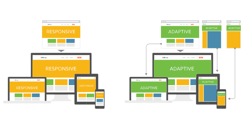
Here are the main advantages of these two design approaches.
Responsive design:
- will be properly displayed on all available screen resolutions;
- the page content will load faster;
- demands less time, costs, and efforts to create.
Adaptive design:
- makes the website more convenient for users;
- excellent usability testing that greatly influences website conversion.
Both of these approaches are frequently used for design creation, and they are essential but just different. Generally, responsive design has one template and renders it differently, and adaptive design has several templates and shows one that responds to users’ screen requests.
Complimentary UX Consultation
Get the design type which will suit your website the best.
Common screen sizes
Further, we would like to bring the latest screen resolution statistics to your attention. We chose the period from January 2021 to January 2022.
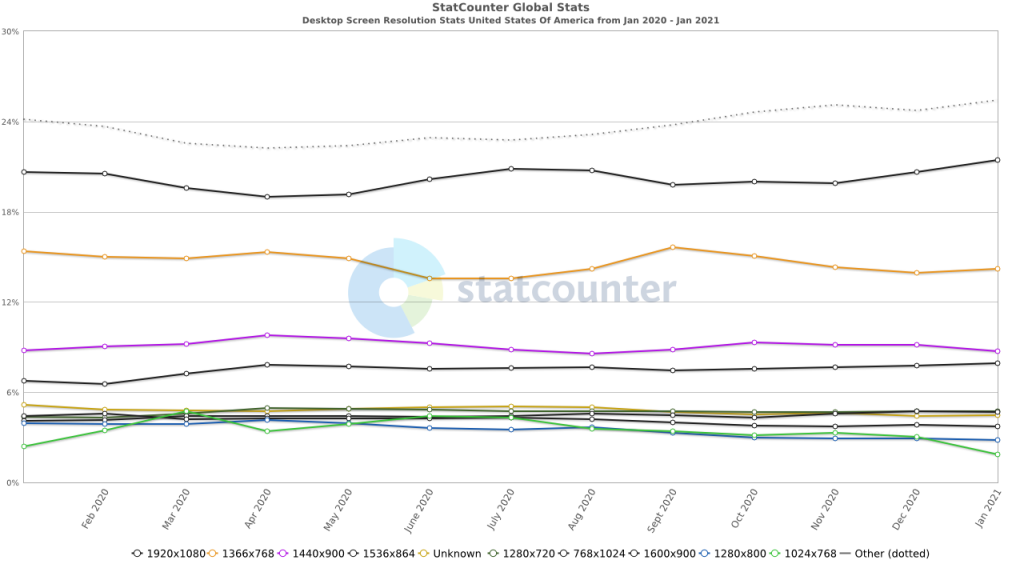
1366×768 | 22.6% |
1920×1080 | 20.87% |
1536×864 | 8.52% |
1440×900 | 6.97% |
1280×720 | 4.81% |
1600×900 | 4.1% |
1280×800 | 2.95% |
1280×1024 | 2.65% |
1024×768 | 2.59% |
768×1024 | 2.47% |
1280×720 is considered to be the most suitable screen resolution for the desktop website version. Usually, the desktop version provides the best user experience and is supposed to be the most convenient and wide.
Mobile Screen Resolution Stats Worldwide
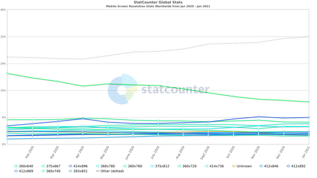
- 360×640 – 12.98%
- 414×896 – 7.82%
- 375×667 – 6.65%
- 360×780 – 6.02%
- 360×760 – 5.27%
- 375×812 – 5.15%
For mobile screen sizes, 360 and 375 widths are considered to be the perfect match. Thus, the content is well-readable and convenient for users.
Tablet Screen Resolution Stats Worldwide
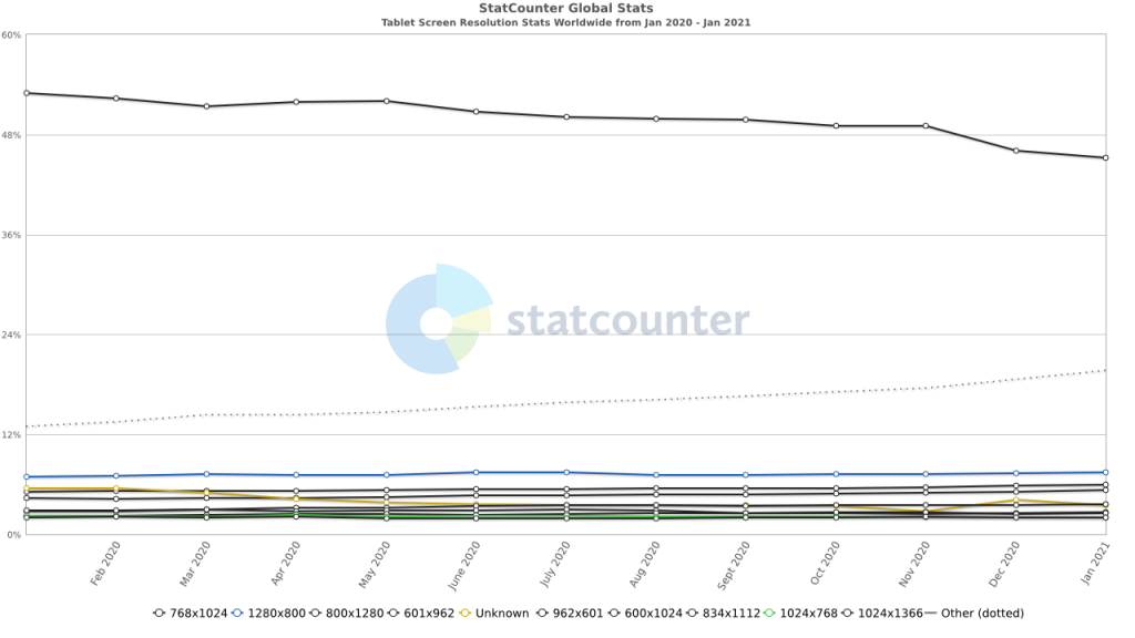
- 768×1024 – 6.11%
- 1280×800 – 7.38%
- 800×1280 5.9%
- 601×962 – 5.15%
- 962×601 – 3.52%
- 810×1080 – 2.83%
What about the tablet screen resolution, 1280×800 and 768×1024 are the best choice. As we can see, the statistics match our architect’s decision. It also depends on the tablet model and its screen size.
Desktop vs. mobile vs tablet worldwide
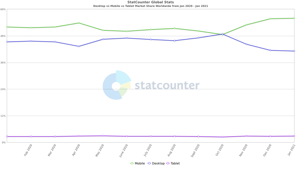
In Total:
- Mobile – 55.73%
- Desktop – 41.46%
- Tablet – 2.81%
Desktop Screen Resolution Stats in the USA

- 1920×1080 – 20.66%
- 1366×768 – 13.96%
- 1440×900 – 9.16%
- 1536×864 – 7.79%
- 1280×720 – 4.74%
- 768×1024 – 4.72%
Mobile Screen Resolution Stats USA

- 414×896 – 20.52%
- 375×667 – 13.18%
- 375×812 – 12.65%
- 414×736 – 6.63%
- 360×640 – 5.41%
- 412×869 – 3.67%
Tablet Screen Resolution Stats USA

- 768×1024 – 50.14%
- 800×1280 – 7.07%
- 1280×800 – 6.55%
- 601×962 – 6.03%
- 810×1080 – 3.7%
- 962×601 – 3.27%
Desktop Screen Resolution Stats in the UK
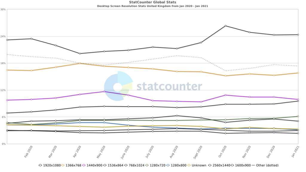
- 1920×1080 – 24.28% (more than in the USA)
- 1366×768 – 15.29%
- 1440×900 – 10.45%
- 1536×864 – 8.89%
- 1280×720 – 5.68%
- 768×1024 – 5.52%
Mobile Screen Resolution Stats UK
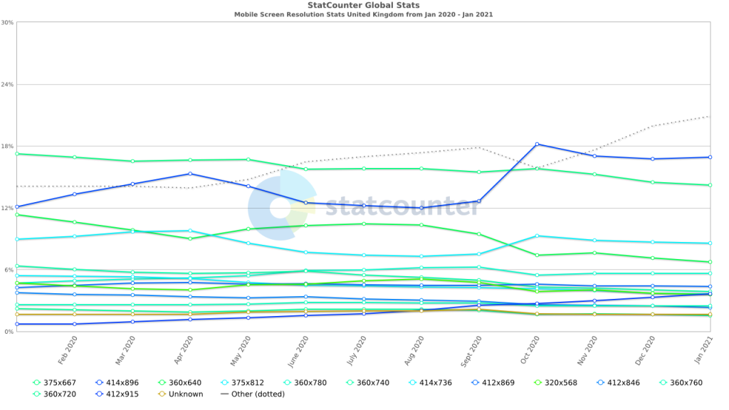
- 414×896 – 16.73%
- 375×667 – 14.47%
- 375×812 – 8.65%
- 360×640 – 7.12%
- 360×780 – 5.62%
- 412×869 – 4.4%
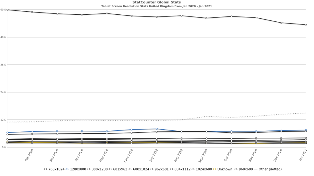
Tablet Screen Resolution Stats UK
- 414×896 – 16.73%
- 375×667 – 14.47%
- 375×812 – 8.65%
- 360×640 – 7.12%
- 360×780 – 5.62%
- 412×869 – 4.4%
Best responsive design examples
We would like to present several examples of responsive design of the website that we all know and use.
New York Times Website
The New York Times is a worldwide top newspaper. Thus, they should have provided suitable screen sizes for responsive design for different devices, particularly desktops, tablets, and mobile. The interface looks like a traditional newspaper – white background and black script. This classic combination is easily readable from different devices.
The navigation also differs – the desktop version shows the entire menu on the first screen; in the tablet and mobile versions, the menu is separated into the side columns providing a more convenient user experience.
Amazon E-commerce Website
YouTube App
How screen resolution affects professional designers?
Depending on clients` preferences, the ways of reaching the visitors and what experience they will have defines the future design – responsive or adaptive. It is impossible to say which way is the best for use. Both of them have their pros and cons, as they suit different websites and industries. However, device resolution is crucial to consider as you can not predict the type of device your visitors will use to surf the website.
Have a look at our blog post on What Dimensions & Resolution Should Be For iOS And Android App Design.
Mobile screen sizes for responsive design (compared to desktop and tablet)
Our dedicated CSS developer provides the top common screen sizes for different website versions, particularly mobile responsive design, as well as desktop and tablet.
Mobile resolution
The minimal mobile screen resolution is 320px in width that is suitable for iPhone 5SE. For the latest version of smartphones, screen resolution depends on the target audience. So it can be 320, 360, or 375 in width. This example suits perfectly for iPhone8 or iPhone X.
Desktop resolution
As for the desktop version, the best choice is the 1280×720 screen resolution. It is a minimal desktop screen size recommended. Usually, the desktop version is user-friendly and perfectly readable if the screen resolution width is more than 1280.
Tablet resolution
The tablet screen resolution varies between 1280×800 and 768×1024. The last one is a tablet portrait view, and the 1024×768 size is consequently landscape orientation. Therefore, the tablet design should be performed on a resolution with a width of 768px.
Best practices for implementing responsive design for your web
To design the website using a suitable design approach, it is better to research the most successful practices for implementing responsive design. Here below, you can find the list of the key design practices:
- Define your breaking point
Breakpoint defines the way content and design will be adapted to provide an excellent user experience. Usually, breakpoint marks the disharmony between content and screen resolution. The number of breaking points depends on the number of devices and their screen sizes to monitor if it provides responsiveness.
- Create variable designs
Each design mockup needs to have the ability to change and extend. When a design is fixed, the screen view can be warped. A designer has to be sure their layouts are perfectly sized according to a particular device.
- Minimize the differences
Despite the various devices, the interface has to stay the same and contain a minimum of differences between versions. The easiest mockup is a desktop version, as it provides enough space for the reading of all elements. Tablets and mobile screens require major attention as there is less space to render each element correctly.
- Mobile is the priority
As we have already mentioned, due to the smaller screens of mobile devices, there might be more differences. So it is better to design a mobile version first that limits the desktop one.
- Widen the functionality
We all know that it is not really convenient to type on the mobile version to search for something or log in. So it is useful to add QR codes, fingerprints, or face IDs for authorization. Responsive design is all about simplifying the user experience.
- Testing is crucial
Testing is one of the most important steps in the development process. To ensure that the design is responsive and properly displayed on different screen resolutions, you need to test it using responsive design checking tools.
Pay attention to our blog article where we described 2 Different Ways to Convert a Website to an App.
Tools to test website for different devices friendliness
We put together a list of the best tools to test the website for different device friendliness that are actively used in our company.
Browser shots are considered to be a classic testing tool to monitor if the device interface is user-friendly. This is an online service for taking screenshots as quickly as possible in any version you would like to see. This helps to check if there are any errors or misalignments. Browser shots are a completely free and simple in-use testing tool. However, this tool is suitable just for simple content, so if the website is more interactive, you’d better find another testing tool.
Browser Serling is one more online screen resolution testing tool. This service provides full interaction with the website, meaning not only showing the interface but testing its functionality. Here you can choose any version you would like to see and start page rendering. The tool is free, but you will have to wait for your turn as the number of active users is limited and can vary.
Browser Stack is a cloud testing tool for checking the web and mobile interface friendliness on desktops, tablets, and smartphones. The web version can be easily tested in various browsers and the mobile version on different mobile devices and operating systems – iOS and Android.
Mobile-Friendly Test by Google
Having a mobile-friendly website is a critical part of your online presence. In many countries, smartphone traffic now exceeds desktop traffic. If you haven’t made your website mobile-friendly, you should. Search Console’s Mobile-Friendly Test Tool is a quick, easy way to test whether a page on your site is mobile-friendly.
The Mobile-Friendly test tool is easy to use; simply type in the full URL of the web page that you want to test. Any redirects implemented by the page will be followed by the test. The test typically takes less than a minute to run.
The Mobile-Friendly test tool is easy to use; simply type in the full URL of the web page that you want to test. The test will follow any redirects implemented by the page. The test typically takes less than a minute to run.
Our blogpost on Website Redesign ROI is a must-read for you. Click the link!
How to make your website mobile-friendly?
The interaction between the user and the interface should be considered. This means that all buttons and links should have suitable and convenient sizes to provide easy and accurate clicking for users. Navigation is a crucial component and depends on a particular website and its services.
There are several popular navigation examples:
- hamburger menu
- tabs panel
- separate page
For the website’s mobile version, scripts should be well readable and bigger than the web version has. The Mobile version demands a high page load but should be thrifty according to traffic. Pictures adaptations are essential as well, and all images at high resolution should shrink on a mobile screen.
FAQ
Responsive web design is an approach to website design that aims to make web pages render well and adapt to a variety of screen sizes, resolutions, and devices. This design methodology enhances the user experience by ensuring that websites automatically adjust their layout, images, and other elements to fit different screen sizes and orientations, such as desktops, laptops, tablets, and smartphones.
Responsive testing provides website scalability and automated matching the sizes of different device screens. Consequently, it positively influences the user experience and builds a great brand reputation.
There is a wide range of responsive design testing. Our specialists usually use three of them: Browser Shots, Browser Serling, and Browser Stack. All you need to do is to copypaste the URL and sign up for the page you want to check.
The variety of devices is wide and constantly updating. Among the most popular website testing devices are iPhone 8 and iPhone X, Samsung Galaxy S8, and GooglePixel. All these devices are usually available in online testing tools.
The most popular screen sizes for responsive design are constantly changing due to the continuous release of new devices and updates. Some of the most commonknes include:
- Small mobile devices (portrait mode): 320px to 480px
- Medium mobile devices (portrait and landscape mode): 481px to 767px
- Large mobile devices and small tablets (portrait and landscape mode): 768px to 1024px
- Tablets and small laptops (landscape mode): 1025px to 1280px
- Laptops and desktops: 1281px to 1920px
These ranges can vary depending on the specific devices targeted and the intended audience for a website. It’s crucial to stay up-to-date with the latest trends and device specifications, as well as to consider using a fluid grid and flexible media approach to ensure optimal responsiveness across various screen sizes.
To end up
Correct screen resolution selection is possible only through intensive testing. Before the design release, you make a 100% effort to provide your page content’s readability and scalability. Due to the appearance of new devices and screen sizes, the website design should respond to these changes and improvements.
Start building a responsive design to optimize your online presence and engage potential clients more effectively. Our team of experts is eager to assist you in developing a responsive design tailored to your specific needs. By collaborating with us, you can expect a personalized approach and an innovative solution for your website, ultimately maximizing its profitability and enhancing your business’s success.


