

We create 2.5 exabytes of data every day. Or 2 500 000 terabytes per day. Financial industry generates a big chunk of this data. What's more, fintech is one of the most active users of this data.
Back in 2015 firms from fintech spent around $6.4 billion on data-related programs. analysts site that those spending will increase by 26% annually. By now, about 80% of all companies from this sector are exploring Big Data and predictive analytics. Two-thirds of enterprises have even appointed a chief data officer for those purposes.
Unfortunately, using Big Data in financial services comes with a price. The more data you have - the more difficult it becomes to process it. At some point, you may be unable to create even a simple reports, because your spreadsheet contains too many different rows and variables.
Both examples of Big Data usage in fintech and reasonable methods of data mining/processing in banking you can find in this blog post. There’s a lot to say on this topic and we’ll continue to explore it in future.
However, in this article, we’d like to solve a more practical problem that faces 80% of specialists from world financial services. How to visualize financial data that you already have? What are the best tools to apply? How to make complex finance reports legible for your clients and comfortable for analytics?
Different Types of Data Visualization
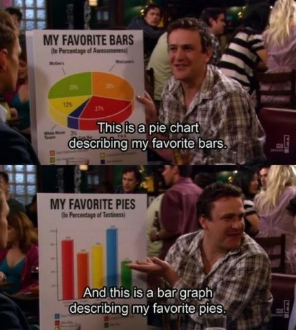
But first, let’s make a dive into the fascinating world of graphs and tables! Well… dive may be too boring for starters, so we’ll just dip few toes in the water.
Most Popular Chart Types
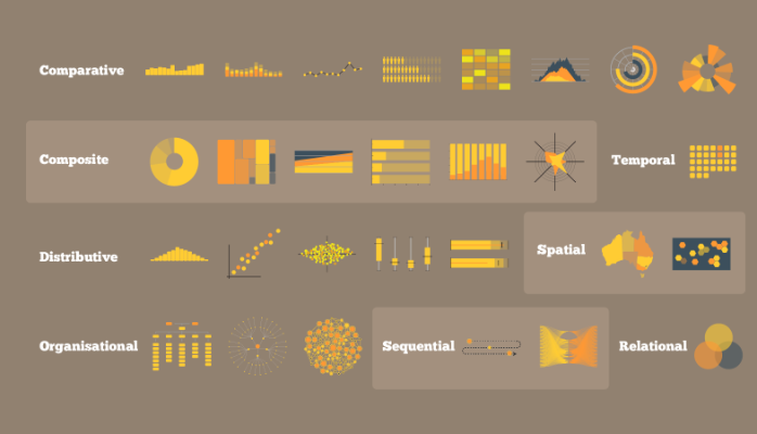
- 2D / 3D Area (Cartogram, Choropleth, Dot Distribution Map);
- Temporal (Connected Scatter Plot, Time Series, Polar Area Diagram);
- Multidimensional (Pie Chart, Scatter Plot, Histogram);
- Hierarchical (Dendrogram, Ring Chart, Tree Diagram);
- Network (Alluvial Diagram, Node-Link Diagram, Matrix).
Obviously, choosing the right tool may be as important as knowing how to use it. That’s why it vital to understand the goal of visualization and format of data you need to visualize first.
Remember what we’ve mentioned in a previous article about Big Data: “Data Science only works when business people ask the right questions, have right tools to get answers and take actions with the answers.”
Before choosing visualization format - answer this simple question first:
- What information do I need to answer my questions?
- How much detail do I need?
- What do I need to show: comparison, composition, relationship or distribution?
Next, refer to this diagnostics table.
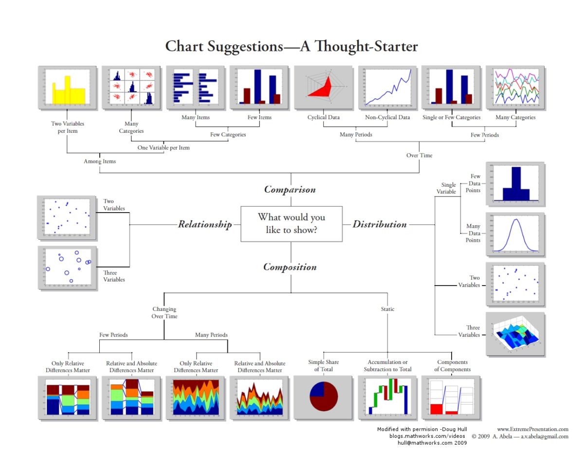
The Table of Tables
And if you’ll someday need to implement or develop a visualisation tool (simple or complex) - this Table of Tables will help you to diagnose which type of visualization type you actually need.
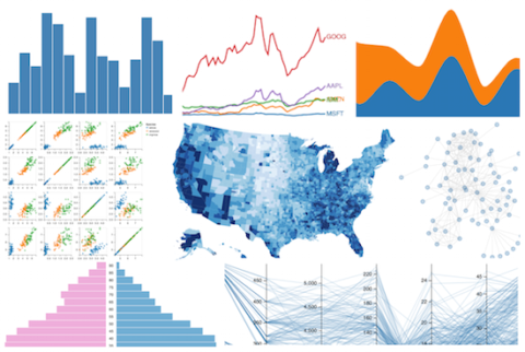
Best Data Visualization Frameworks and Libraries
The hard part is over! Now, we’ll refer to the best ready-made code solutions that for financial data visualization. Keep in mind that there are many other libraries and even a lot more ways to develop a custom tool. But those we mention here are the most appropriate for fintech industry and therefore can save you time/money on the development stage.
D3
![]()
Shortly speaking Data-Driven Documents (D3) is a most popular JavaScript library used to generate SVG graphics. And for the SVG-based data visualization, there is no better library.
The best thing about SVG graphics is that it doesn’t require more disk space when upscaling. For instance, a typical raster image with the resolution of 1920x1080 weights 2 megabytes, while an SVG file will weight 0,3 megabytes and upscales for whatever resolution you’d like.
Obviously, in the wake of hi-res monitors and Retina displays SVG (Vector graphics) proliferates even faster and therefore D3 becomes even more important. It allows you to visualize chart of any complexity while preserving disc space and internet bandwidth.
Plus D3 is very flexible and can pair with additional libraries to display even more complex charts. For example MetricsGraphics.js, a library built on top of D3 that made specifically for visualization and pinpointing time-series data.
VEGA
If you don’t bother much about custom graphic representation and need a simple, solid, good looking chart then VEGA is your best option.
Basically, VEGA represents a framework built on top of D3 library. It has a simple syntax and allows one to describe data visualizations in a JSON format instead of writing JavaScript code.
In addition, VEGA allows you to generate graphics in the browser by using more trivial HTML Canvas, which makes it a perfect choice in terms of sharing potential.
InfoVis
InfoVis is a great toolkit if you want to develop an interactive visualization map. What’s good about this toolkit is its flexibility. By using its potential you can easily turn your dataset into a flexible web app that will support graph control and allow your customers directly interact with data.
InfoVis offers a variety of advanced option including tree animation, direct graph manipulation and editing on the go. For example, you can make such cool Wind Map and tweak its parameters from the web browser window.
DC.js
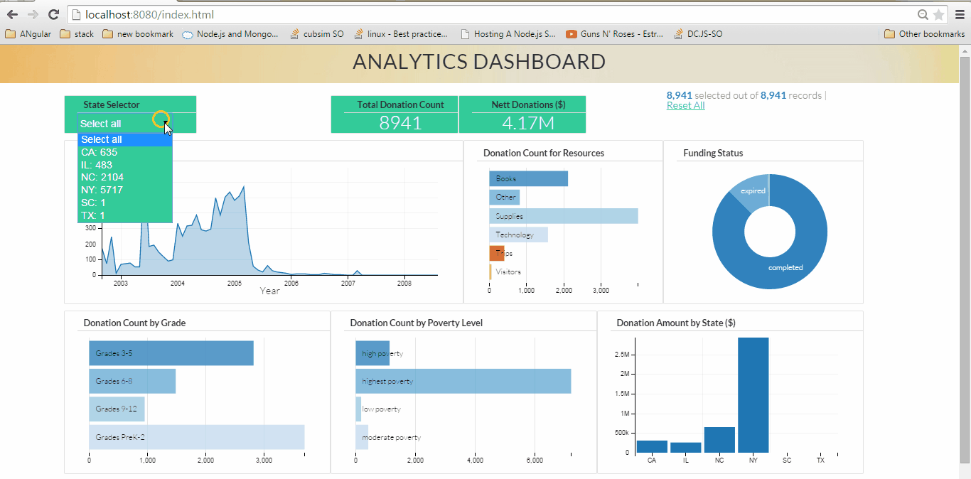
Another cool JavaScript library the offers high interactivity. The official website states that DC.js is an easy and yet powerful javascript library for data visualization and analysis. It works great no matter which platform you choose desktop or mobile.
DC.js charting library is also highly efficient in times when you need to explore a large multi-dimensional dataset. By using dc.js all chart rendering goes with instant feedback which comes in handy when you need to compare several charts at once.
DYGRAPHS
A fast-running JavaScript library for charting. It can work with a complex data structures that have a high density of information. If VEGA boasts design simplicity, DYGRAPHS is ultra-flexible in terms of development and it works fine in all major browsers.
In addition, DYGRAPHS comes "interactive" out of the box, which can save a lot of time during development. The option like pan, mouse movement, zoom and swipe are available by default on desktop and mobile devices.
Springy.js & Sigma.js
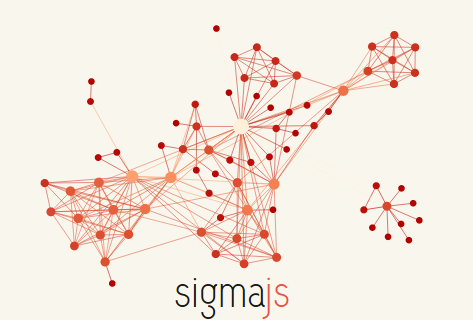
Two interesting libraries that come apart from others. They are used for very specific tasks such as network visualizations and dynamic network exploration. If you need to show complex interconnecting system or puzzle out a corporate structure - one of these libraries can do the trick.
Springy.js is a library that relies on an algorithm to create force-directed graphs, resulting in nodes reacting in a spring-like manner on the web page. In other words, it allows for graph manipulation and calculates a graph’s layout to display it optimally on the page. Sigma.js, on the other hand, is better in complex tasks such as build highly advanced line graphs.
Bottom Line
So, here you have the best libraries for effective data visualization. They can be used both for internal use of your data experts or in order to create an impressive presentation for clients. In addition, most of the toolkits mentioned above boast good interactive capabilities which can be a great advantage in cases when you need to make an adjustable report.
For sure, a complex visualization may require from you to have a professional coder on your side. If you'll ever need to develop a smooth and classy visualization for your dataset - feel free to contact us, we adore playing with chart and graphs.


