


Table of Contents
More and more companies use web applications for their business purposes. However, not all of them are appreciated by their users due to poor design solutions. And this article, we will explain how to create good solutions design that will enhance user experience.
Web apps are dynamic online applications that let the user perform tasks and manipulate elements in a highly interactive way. Users follow particular paths based on the tasks they want to complete. There are a huge number of web applications in the world, and only a small part of them is able to hold attention and give a positive experience of interaction with them. It is possible thanks to decisions that can be ignored in the design process.
Why Is a Positive User Experience Important for Your Company?
Although web app design requires a much sharper focus on responsive site elements, performance across multiple devices, and a streamlined user journey, UX and UI design solutions have an important role in customer satisfaction.
Template selection is the basis for a well-designed web application and its customers’ needs (e.g. gaming, business, social networks, maps). You need templates for different users within the same application. Tables work better for users who work with apps every day, and they don’t work well for users who rarely use the application. The right patterns for the right interaction are just as important.
A polite web application increases user satisfaction, does not annoy the user and, when repeatedly accessed, the user stays or works in it for a longer time. This creates a positive user experience that is essential to your business goals. The following design solutions may help to achieve this goal.
UX/UI Design solutions
Don’t let the user get out of the way. Keep it simple
Minimalism has been among the key trends in web design for the last few years and is still relevant. Removing all unnecessary components means simplifying the interaction for the user. Don’t let the user get out of the way. When they open the app, you want them to engage a particular way and do the specific steps. If they have to solve a labyrinth to find what they want, they will be more likely to leave the app and get annoyed.
What you can do to avoid that:
- One intention per page. If the page is overloaded with information, the visitor will probably be confused and fail to understand its purpose and advantages. Improve web application interface by using internal linking and connecting all the pages. However, let each be devoted to the particular subject and goal.
- Understandable intent of the page. With its help, users can stay or move to another one without losing time and wondering what they are seeing. Use Navigational elements and headlines to make it easy to comprehend the page goal.
- Focus on the most relevant information. Feel free to post related information to the page, but do not give it a key value.
- Progressive disclosure. To reduce complexity in a user interface, employ progressive disclosure to defer secondary options to a subsidiary screen. This focuses users’ attention on the primary options, which are the only ones shown by default.
- If you can add more and more features and several different ways of doing a task, should you do so? No, more UI doesn’t mean more usability. Usually, less is more, so focus on users’ key tasks and design simple interactions for each task.
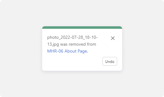
Making mistakes is normal
Like all people, users of your product tend to make mistakes. Errors that cannot be corrected create fear to use the application. At the same time, fear of possible punishment for the committed action increases, and satisfaction decreases. Give users a second chance and the opportunity to correct their mistakes.
There are several simple design solutions:
- The UNDO button does a great job with this.
- Modal window with confirmation of the irreversibility of the action.
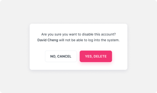
Each method works great in certain situations. But do not forget that such pop-ups in most cases knock users out of the workflow.
Make waiting more pleasant
How often have you tried to understand if the app is still processing your action, or if it has failed? Web apps have to consider how the UI will look while in a loading state.
You’ll inevitably face situations when reaching the highest performance won’t be possible, for example, when users have a slow internet connection.
Try to make waiting as pleasant for users as possible.
Use skeleton screens instead animated spinners that are placed anywhere: mockups of text, images, or other content elements. Skeleton screens are more about progress and action.

This is called perceived performance. The idea is that users are more loyal and patient and think of a system as faster if they can anticipate content when it’s not loaded yet. It may be called managing users’ expectations.
Think about of customers with mobile devices
More than 50% of web traffic comes from mobile devices. As such, if your web app isn’t mobile-optimized, users are five times more likely to abandon it. So, you’re shutting out your potential customers by not optimizing your app for the best mobile experience. How to be with this part of users?
At the same time, a mobile-friendly app hugely impacts indexing; your SEO department will agree.
Essential mobile user interface design tips:
- Locate all buttons, especially the call-to-actions, in the middle.
- Make sure the information is fully displayed on the screen in vertical and horizontal mode.
- Allow taking actions in one click. Most users operate the phone with one hand.
Move burger menu to nav bar (Get rid of the footer)
Given that, it is not surprising that there is no footer in native apps. It means that progressive web applications should follow their lead. It will be a good idea to define the most important navigation items and create a navigation bar.
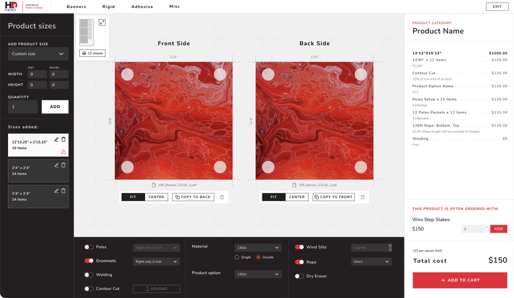
Data Tables
Many web apps are based on a table, as they enable working with huge data masses.
Compared to modular presentations such as card-based displays, tables are space-efficient and well-suited for comparing records and detecting patterns in the data.
Tables that cover not only basic users tasks (reading and scanning records, comparing data, viewing/editing/adding/deleting records details), but also making them easier to work with, are more likely to turn a user’s routine into a “pleasant walk with a cup of coffee.”
To achieve this, the tables in the application can be enhanced with the following solutions.
Reading Record(s) that Fit Specific Criteria
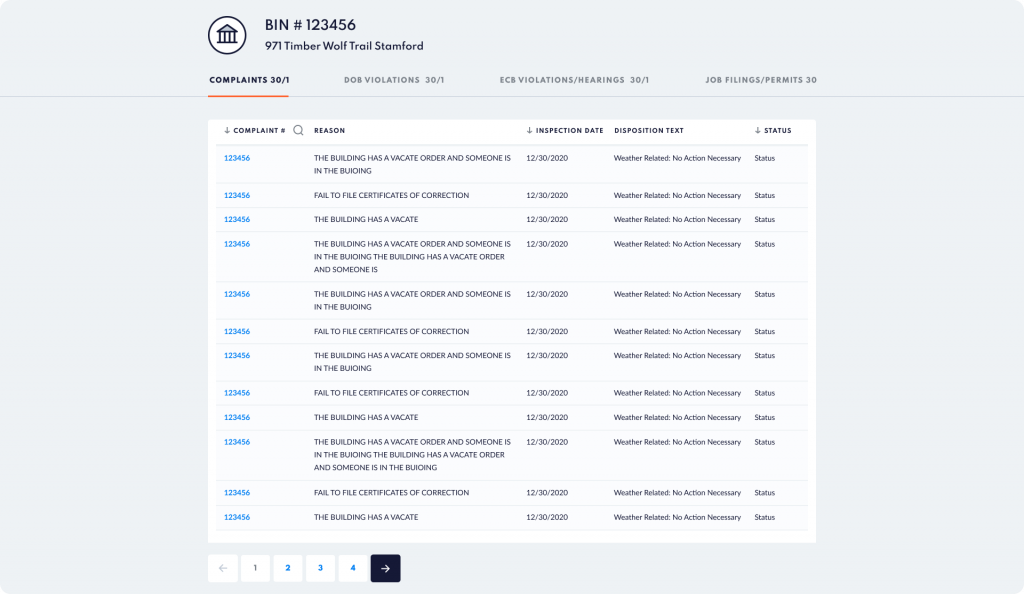
- Main column. The default (main) column should be a human-readable record identifier instead of a “mystery” automatically generated ID. This design will allow users to scan and locate a record of interest.
- Order. The default order of the columns should reflect the importance of the data to the user and related columns should be adjacent.
- Filters. Filters need to be discoverable, quick, and powerful. Filter syntax should be transparent to users and understandable stating that users are looking at filtered data.
Compare Data
This will help your product be more user-friendly and take and get user sympathy.
- Locating Relevant Info. Freeze header rows and header columns (if the table is larger than the screen). Borders, zebra striping, and hover-triggered highlighting of a record can all help.
- Making Information Adjacent for Comparison. Hiding and reordering columns must be easy to accomplish the best way to implement it (low interaction cost and accessible for those that don’t use drag and drop interactions). This is the solution as a part of app customization helps cover different users’ needs.
View. Edit. Add
- Edit in place (where the table row becomes editable). Save users time and remove unnecessary clicks. This solution works only if the table is narrow.
- Modal popup. Best works for short forms because it doesn’t take huge system and hardware resources.
- Non-modal panel or separate window. Either of these options will cover some of the tables, but still, allow users access to the table data.
- Opening the row as an accordion. Works best with preview details without necessarily opening a new window or modal pop-up.
And how to be about users with mobile?
Since mobile devices have a small screen width it imposes some restrictions. The view of tables should be adapted to this peculiarity:
- Cards view with necessary data.
- With the possibility to see record details in a drawer modal popup with extended data and actions.
How to Increase User Autonomy in UX Design
Interface customizations
All customers have their own needs while working with apps. Give a possibility to customize and test app layout and features to themselves, and you will see how users become happier.
Try it Yourself
Providing the custom-tip option changes little for the business, but allows customers to have complete autonomy. Increasing autonomy may not necessarily mean increasing the number of choice options, but rather giving users choices where they currently have none.

Two Helpful Tips
- Stick to a few options. Generally, simplicity is better than more choices because the human mind has its limits. But don’t forget about the custom option.
- Provide meaningful defaults. You need to choose basic defaults that will bring benefits to important user groups.
Conclusion
UX design is all about empathizing with user needs and creating a user-centered design that meets those needs. We have an obligation to treat our users better. We will never be able to create a universal design that meets the needs of each user without adapting to different audiences. Finding opportunities that allow users to make choices considering the end goal allows them to align our designs with personal preferences and priorities.


 Záhradnícka 95, 821 08 Bratislava, Slovakia